Recently, I released my private project application for beta version.
I have been working as web developer for 5 years in some companies and I am web developer. However, I will not talk about programming in this article but how to design icon in your private project.
I am going to write about programing in other articles someday.
Introduction
Self Introduction
As I said, I am web developer not designer. I mainly use Rails and React. At the beginning of my web developer carrer, I started to work as server side developer and generally I get interested in front end technology and React. Finally, I also use React Native these days.
Besides, actually I am developing an memo application. The name is "Papyrus".
It is released as beta version.
I already have released my some applications until now, but I couldn't make my application's logos be cool. I don't know why. I could never design it as I expected.
However, finally, I could finish the karma, thanks to my designer friend. I have a confident of the current icon for my application. (I will show you the icon below) I ask him how I should desing apllication's logo and he gave me some advices. I can't say that if you follow this process, you can definetly create cool icon though, you'll come to be able to do better by the process I organized.
What's Papyrus?
Papyrus is memo application which run on Mac OS and it is implemented by Electron.
There are some memo application in the world, but it usually has a feature to organize your notes.
It's overspec for me because I'm lazy. Those memo apps are better way to write down but I 'm too lazy to handle it.
I usually use such applications' draft for my blog but I needed a memo application like flyer on purpose of writing down my idea or command temporally.
That is why I created Papyrus. Beta version is released now and that is developing. If you download and use it, I'm going to feel happy. Besides, giving me feedback is going to make me be happy.
Applications such as Inkdrop, Boostnote and Evernote are too great,
- Jet down your Todo list
- Memoize your command it's hard to remember
- Draft message you are sending
- Copy a part of logs
These are Papyrus's usecase. It is going to fit these kind of short-lifespan memo.
Papyrus's Icon
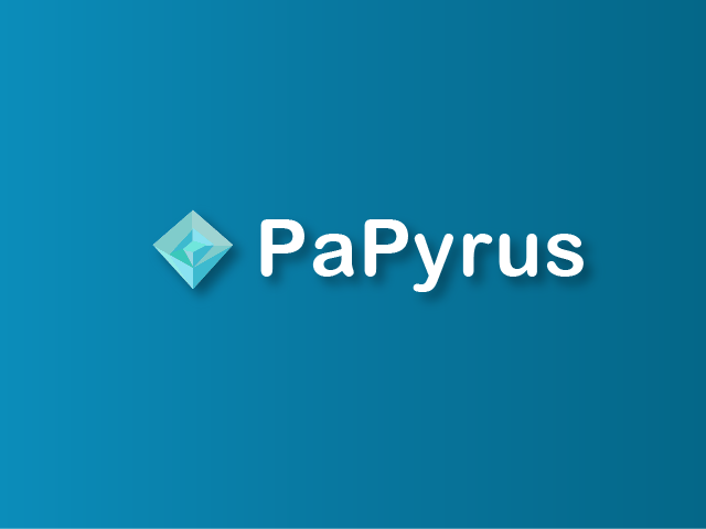
Without further ado, I will talk about icon. I designed and implemented in PaPyrus by myself and of course, I designed icon as well.
This is the icon:
How do you think about this icon?
I have ever run some private web services though, my icons I designed before were too ugly to show others. Compared to them, this is cooler and This one is the best icon I have ever made. Besides, I got to sort of understand how to design an icon for application so I decided to verbalize.
How to make icon in your private project
For making PaPyrus icon, I wanted to make cool log match with application designe so I need some advice from designer and I asked a designer I know about it.
I summarized the advices and tips I googled as follows:
- Select an basic object associating with application
- Sketch object
- Abstract the sketch
- Give the abstact sketch the finishing touch
Select an basic object associating with application
This idea is from result I googled and I did trial and error though. First of all, You get to choose a basic object assocating with your application.
This time, PaPyrus has a image of paper literaly so I decided the object is "paper".
Evernote log is an elephant and it has a part fliping page on upper left of it. Thus, Evernote's logo associate with "elephant" + "paper". That of Apple is "apple" and Sketch applies something like "diamond" for its symbol.
In this way, you have to pick up an object for your project at first. It is intersting to select multiple objects as Evernote do ( "elephant" + "paper"). However, it is harder for beginner or developer who are not familier with designing logo to do that.
Anyway, if you want to choose more than two motif, I recommend you sketch each motif and combine with them in post process.
Sketch the object
This is most impressive advice I recieved from the designer. He said
"Don't open Illustlator at first. Sketch first."
As he said, I have made not good icon by starting from using Illustlator...
Then, I thought I started from sketching, but I have never doing since I was high school student. However, You can't tell unless you try. I tried to draw my hand.
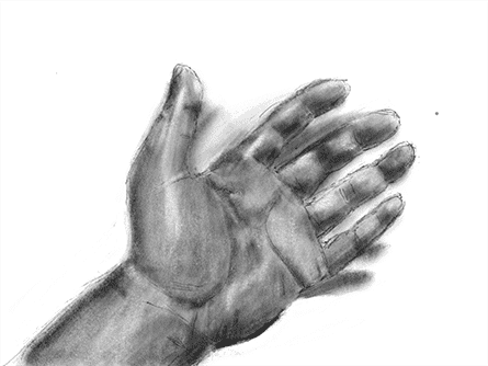
I have no idea about sketching so I sketched while I watching a vide on YouToube.
However, at that time, An idea come up with in my mind.
" How can I make good icon through this process???"
I asked him to give me some advices about that with such a anxiety. And then, He said the purpose of sketching is "polishing observing skill"
Certainly, you can't draw in detail while you are sketching if you originally recognize those differences. (You can't illustlate well, if you copy an incorrect image with a paper.)
After I understand this point, I did trace some icons and sketching in order to understand how cool icon is drawn.
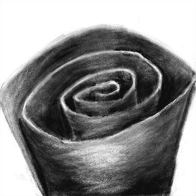
How about? I rolled the paper because I wanted to express the texture of paper. Now, it seems like harder for a paper, but this goal is not to sketch it well so it's OK. For me, this sketch was enough and I maked icon base on this sketch.
Besides, Following is too terrible sketch to continue..
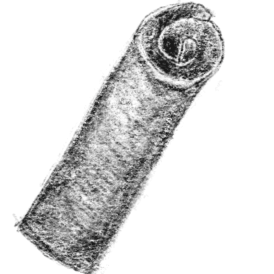
What is this? This is like spring roll. I was not going to draw it! Anyway, let's enjoy the process with failure.
Abstract the sketch
Next, you abstract the sketch you drew and it approaching to icon. Until this, I sketch it with Procreate so I keep on illustrating with it.
First, this is a first idea.
This image is colored but I recommend you draw only outline of then abstracted icon with lines and add colors to it after that. I emphasized the looks rolling up the paper while I was abstracting.
I thought icon was getting better, but it was a little bit too artisitc. That was why I gave it finishing touch by using Papyrus's imaging color.
Give the abstact sketch the finishing touch
If you can make icon you are satisfied, you can skip this process. However, I needed to organize it with Illustlator.
This is final version.
I wanted to compated between some sort of version so I made difference patterns' icons. Finally, I picked up upper left one. I liked black one though, it's far from application theme so I didn't choose.
Done!
When you finished, export your favourite icon. As for now, I show you icons of before and after.
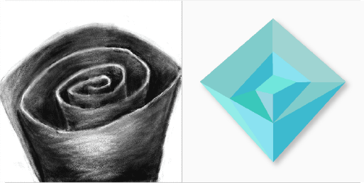
Final version was daramaticaly changed from the original version I sketched thouhgh, you would be able to clear your image about icon if you sketched before that.
Wrap Up
This is way I din't write about programming at all though, I'm glad if this article help your project and process of designing icon.
Papyrus is implemented by some interesting technologies such as React, TypeScript, Electron, Go and GraphQL. So, I'm going to write arrticles on the theme of them some time.
Thank you!

